Know Why Is It Important to Colour Grade Your Image?
Have you ever seen any image or video that has interested you, and you feel awed about it? If true, you have seen a well-colour-graded image or video. But what is colour grading? Is it something that anyone can do?
Most importantly, what does colour grading do? If you are someone who does not know much about photography or has heard the term 'colour grading' for the first time in your life, this article is perfect for you.
Here, you will know why colour grading is so important for images. This article will provide the necessary knowledge if you are an aspiring photographer. Now, let's get into the article.
What Is Colour Grading?

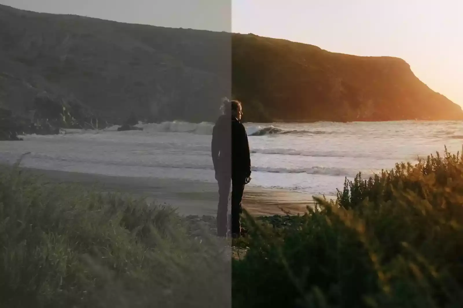
Colour grading is nothing but an expensive way that helps to expand the appearance of an image or video. As a result, the images appear more attractive and aesthetically pleasing to the viewers' eyes.
Colour grading is essential in making any image or video look impressive. It is also one of the factors that filmmakers mainly focus on to make their films look more impressive to the audience. The whole process of making an image look beautiful is divided into two parts.
1. Colour Correction- Colour correction is adjusting colours with various tools. You can correct the colour of an image by adjusting the temperature, contrast, white balance, and exposure.
2. Colour Grading- Colour grading is more expensive, less technical, and a more creative process that every photographer and filmmaker relies on. Colour grading helps to add emoticons to an image. For example, suppose you are watching Romcom; you do not prefer to feel spooky but light and cheerful.
A filmmaker ensures that the viewer gets the natural feel of the video or image while watching something. Simply put, colour grading is directly linked to people's psychology and helps us enjoy what we watch on the screen.
The Secret of Colour Psychology in Colour Grading

Have you ever come across an Instagram image and felt awestruck by it? Well, people use various Instagram filters to enhance the beauty of a particular image. That is also a colour grading. But actual colour grading requires more filters and more advanced applications.
But how can you know which colour to choose for which photograph? Is there any rule you need to follow? We hate to blow your bubble, but there is no colour grading rule. But there is colour psychology that you must follow to have a clear insight into colour grading.
- Green represents nature and freshness. It also represents growth, envy, and jealousy. So, green is the colour to go for when you click an image of nature or prefer to highlight any of the emotions we have just mentioned. But remember to use it correctly.
- Red is linked to passion and love. But it also represents violence, aggression, and danger. So, you can use red while trying to highlight any of these.
- Yellow is one of those colours that shows both goodness and evil. It also shows jealousy and optimism. Now, it is up to the photographer how the person thinks the colour should be used.
- Blue represents loyalty, compassion, and harmony. While this colour can create a vivid look of an image, it can also give it a dark look.
- Purple is a colour that has a calming and positive effect on people's minds. It represents mystery and the unachievable. But it also represents fantasy and dreams.
These colours we have mentioned above affect our minds. That is why the colour palettes are divided into cold and warm colours. Depending on the colour you apply to an image, you must adjust the saturation, temperature, intensity, etc. So, the next time you edit an image or colour grade it, keep the psychological effect of colour in mind.
The Secret of Colour Harmony in Colour Grading

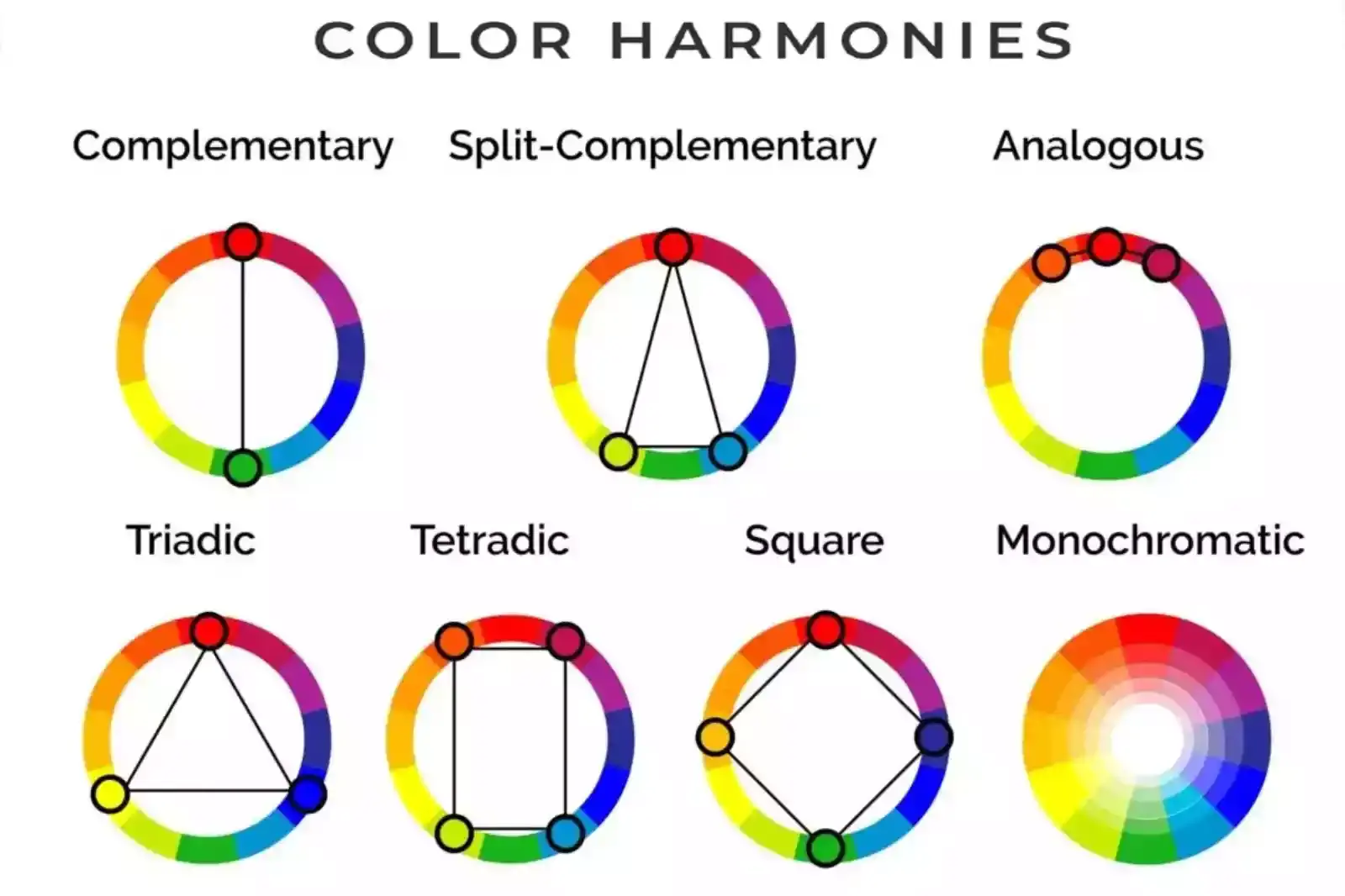
Have you ever thought about why only once in a while, just one image catches your attention? It help to Remove the background of an image. An image's background can help it stand out and look catchy. Colour harmony represents a group of colours that makes an image's background impressive and attractive. There are four types of colour harmony.
1. Analogous colour - These colours are similar and can blend well.
2. Monochromatic colour - A single colour's colour, shade, or tone is applied to an image.
3. Complementary colour - These are the colours that are combined with high-contrast images.
4. Triadic colour - Usually, it has three different colours: one is the key colour, and the other two are blended with balance.
The Importance of Colour Management in Colour Grading

Having a proper sense of colour is only enough if you know how to manage them properly. Colours must always be consistent and well-maintained so the image looks clear yet eye-catching. So, by knowing colour management, you can control how different images look on different platforms.
What Can You do by Applying Colour Grading on an Image?

Colour grading has a few similarities with colour correction. But it is different. Colour grading serves an entirely different purpose for an image. It focuses on manipulating colours to change the mood of a shot. But how does colour grading do that? The answer is simple. Colour grading focuses on the following things:
1. Hue - It is called the purest form of colour. It controls the brightness or intensity of a colour.
2. Value - It is a term that refers to a colour's brightness or dullness. You can control that by applying colour grading on an image.
3. Saturation - Saturation expresses the intensity of a colour. If you know even a little bit of editing, saturation is essential to image editing, making it look catchy. For example, if you reduce the saturation of an image to zero, it will become black and white, and if you increase the saturation of an image, it will be of a different colour.
How Can You Colour Grade Your Images?

You all know by now that colour grading is one of the most essential parts of an image. It controls the mood of a shot by manipulating the colours. But if you are an aspiring photographer and want to know more about the colour grade or its importance, understanding how to colour grade, your image is equally essential.
So, we have provided you with the steps to help you colour-grade your images. So, let's find out how to do colour grading.
Step 1 - Firstly, the one thing you must remember while colour grading your image is adjusting the white balance. Before starting the colour grading, contemplate how warm or cool you want your image to be. Based on that, adjust the white balance.
Step 2 - Once you are done adjusting the white balance, focus on adjusting the saturation or hue.
Step 3 - After adjusting the image's saturation, take a minute and see if all the colours are correctly placed. To do that, keep looking at the histogram. If you see any flaw, you can adjust the image accordingly.
Step 4 - Now, adjust the green, red and blue carves on the shadows and the highlights.
Step 5 - If you have imagined your image to be vivid and colourful, go to the vibrance setting and adjust your image accordingly.
Step 6 - Lastly, the most important thing to focus on for colour grading an image is to learn split toning. Split toning will help you add various colours to the shadows and the highlights of the image, helping you to create a unique look.
Why is Colour Grading Important for Producing a Good Image?
As mentioned earlier, colour grading is an expensive and non-technical way of enhancing an image's appearance. What is the importance of colour grading? Here is the answer. You cannot instruct your camera to click an image in a certain way.
For example, you cannot instruct your camera to click an image that looks like a daytime shot at night. So, to get the image's perfection, you need to apply colour grading. Now that you have a little bit of an idea why colour grading is so important let's find out the benefits of colour grading below:
1. Colour Grading Manipulates the first Impression of an Image

Colours can affect our minds psychologically, physically, and emotionally without making us aware. Colours can also affect our senses. Colour grading, by manipulating colours, can create a new tone and give a completely different look to an image.
For example, think about a movie you have watched in the theatre. The movie has a fantastic VFX effect, and the colours of the scenes fit perfectly with the scenes. You can now get connected to the movie even more than before.
When you watch an image or a video that has properly balanced colours, it can affect your senses differently. Since colours can evoke emotions in the mind of people, manipulating colours through colour grading becomes necessary.
2. Cinematic View

Have you ever wondered why a ghost movie gives away a spooky feeling to the audience? Or why a romantic comedy or an artistic movie gives away a completely different feeling? Every movie requires a different environment to capture the audience's attention.
A filmmaker's job is not just to present a story in front of people but to provide the audience with an experience worth remembering. That is why they always focus on cinematic purposes by colour grading.
Colour grading is an extraordinary art form that helps filmmakers to control whether they want a particular scene to look gory, boring, disturbing, happy, funny, uncomfortable, etc. Based on this representation, the audience absorbs the cinematic experience as reality.
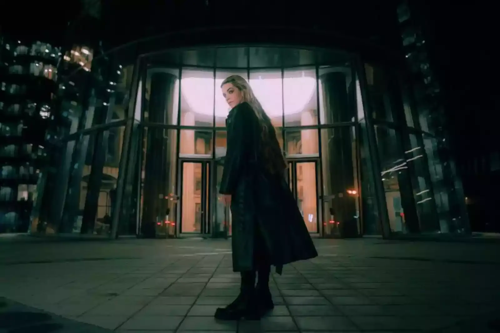
Simply put, the background is most likely black when you watch something spooky. It gives away a sense of fear to the audience. On the other hand, if you watch a romantic or feel-good movie, usually, the videos contain a higher saturation level to make the scene look more cheerful and warm.
3. Colour Grading, a Brand in Itself

If you are a photographer or aspiring to be one in the future, the most important thing you need to focus on is creating a unique style that no one else has. You can only make yourself irreplaceable if you succeed in creating a unique style of photography. It can turn out to be a turning point in your whole career.
But how can you create that unique style? Now is the time when colour grading comes to your rescue. If you can build the capability of choosing the right colour for images or if you can define a colour grading brand, you will be able to express your value and importance in photography.
4. Colour Grading Manipulates The Mood

Colour grading, as we have mentioned above, is one of the most essential elements of photography. As it has the power to affect our mood and thought process, colour grading always takes care of how an image should look like.
It can decide how a particular image will be represented to you. Using colour grading, you can make a day shot look like a night shot and vice versa. You can also add blue colour to add a colder look to an image.
You can also add green or yellow to show the landscape or give the image a warm look. That is how colour grading makes an image look powerful and effective. It can also make an image look blunt or sharp.
Conclusion
When photographers click an image, their job does not end there. That is the beginning of their job. Colour management, colour correction, and colour grading are parts of presenting a powerful image. That is why thinking that colour grading is just a choice is a mistake.
Photographers enhance the beauty of their images by applying colour grading to an image or video. That is why a well-colour-graded image connects with people's emotions. Colour grading is the way that defines the photographers' skill and designs their future.
FAQ's
What is color grading in image editing?
Color grading is the process of adjusting and enhancing the colors in an image to achieve a desired visual effect or mood. It involves manipulating factors such as brightness, contrast, saturation, and hue to create a specific aesthetic or convey a particular message.
Why is color grading important for images?
Color grading plays a vital role in image enhancement by adding depth, atmosphere, and emotional impact to the visuals. It helps evoke specific emotions, highlight important elements, create a consistent look and feel, and enhance the overall visual storytelling of the image.
Can Erase.bg be used for free?
Erase.bg offers both free and paid plans. The free plan usually has limitations, such as a restricted number of background removals per month or lower resolution outputs. Upgrading to a paid plan unlocks additional features and removes these limitations.
Can I use Erase.bg alongside other image editing tools for color grading?
Yes, you can use Erase.bg alongside other image editing tools for color grading. After removing the background using Erase.bg, you can import the image into dedicated photo editing software or apps that offer comprehensive color grading features to achieve the desired visual effect.
Are there free alternatives for image color grading?
Yes, there are free alternatives available for image color grading. Software like GIMP, Canva, Photopea, or mobile apps such as Snapseed or Lightroom Mobile offer free options for basic color adjustments and grading. However, more advanced features and tools are often found in paid software.
Is Erase.bg the best background removal tool for color grading?
Erase.bg is primarily a background removal tool and may not offer extensive color grading capabilities. For color grading, other tools like Adobe Lightroom, Adobe Photoshop, DaVinci Resolve, or various video editing software are more suitable.